Customizing Semantic UI
If you’ve checked out my Pluralsight Course on Semantic UI you’ll know that it goes through the basics of Semantic, but doesn’t look at customizations. Being able to customize Semantic is one of its strong suits, but time kept me from going into any details.
This week someone that had watched my course reached out to me with questions about customization. I figured rather than answering his email, if I wrote a blog post it has the potential to reach more people.
There are several ways to customize Semantic. The first, is theming.
Themes
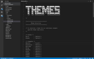
The first way to start customizing how Semantic UI looks is by adjusting the values in the file theme.config. This file is located in the root of the directory where you installed Semantic. For me, that’s simply /semantic
Each line on this file defines a theme for a particular Semantic UI component. The values are all set to default when you first install Semantic. And the values you can pick from are the themes that are available for that particular component.
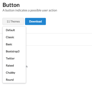
For example, buttons have 11 themes you can choose from, as is shown in the screenshot below.
Each component on the Semantic UI page has a button list that shows its available themes. Additionally, while on the Semantic UI page, if you pick an item, it will update the components on that page to match the theme.
Not all components have all the themes. For example, Twitter doesn’t have a concept of a card so there is no Twitter theme for Semantic UI cards.
In the first screenshot, I set my buttons to have a “round” theme. After making that change, I would need to go back to the terminal and in the folder that has my gulpfile run gulp build. This compiles all the less and sets my buttons to be rounded. As I refresh the page, they will now have a rounded appearance.
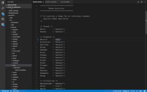
You can also create your own theme. To do this, go to semantic/src and add a new folder with your theme name (I was lazy and just named mine ‘nate’)
Underneath that create a folder for each component group you want to customize. For me, that was simply elements.
Then, add a .variables and/or .overrides file for each component you’re going to alter. In the screen shot you can see I added a button.variables because I was only going to change the appearance via pre-defined variables. If I was going to change things that didn’t have a variable (e.g. box shadow) that would go into the overrides.
Here the only thing my theme does is set the primary color for buttons to be pink. If I were to go to the terminal and rebuild the gulp file and refresh my page, the button would now be pink.
With this approach you can create your own theme and style only the components that you need to theme.
Variables
If you don’t want to go to all the work of creating your own theme, you don’t need to fret, you can still customize Semantic so that it looks different than the semantic out of the box.
As you saw above, there are .variables and .overrides files for each component. Above we used those inside of our theme, but there are also site wide files. For example, if you like how the Twitter button theme looks, but you don’t like the default color, you could set the button’s theme to Twitter and then modify the button.variables file in the site folder to make a change.
Building off of the theme example in the last section, if I changed semantic/src/site/elements/button.variables to have the @primaryColor variable to @yellow and then re-run gulp build, and then refreshed my page, my button will now be yellow, not pink, even though my theme was set to pink.
Semantic applies styles in this order:
Definitions -> Themes -> Site
Definitions are the basic Semantic styles. If you don’t choose any custom themes, or modify any variables/overrides then your styles will be defined by the definitions.
If you use a theme, either by defining your own, or choosing an existing one, then it will apply the styles defined in your theme on top of the definition styles. Anything not defined in the theme will fall back to the definitions.
If you then modify a variable file, it will get applied on top of the theme. Again, if you don’t specify anything, it will fall back to the theme or definition. This allows you to choose a theme, or define a custom theme, and still make tweaks as necessary further down the line.
However, hopefully you’ll notice that the changes should be less and less at each level.
The source definition layer should contain more than the theme layer. The theme layer should contain more than the site layer.
Overrides
Up until now, all the customization has been using variables. Part of that is because Semantic defines a lot of variables for you to be able to use. For example, there is even a variable named linkHoverUnderline which controls whether to show an underline when a link is hovered.
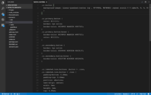
But there is also a set of files for overrides. The screenshot below shows the button.overrides file for the Amazon theme.
In the base .ui.button class it sets a background image for the button, and it does this with a gradient. There is not a variable that you could set that would do this, so the only way to accomplish this is by using overrides.
Depending on what you’re customizing, you might not need vary many overrides.
Wrap Up
Whether you’re creating your own theme, choosing a theme or simply updating variables the number one thing you need to remember is to run gulp build. Otherwise, your changes will not be picked up. I’m ashamed to say I’ve made this mistake more than once. Additionally, if you run gulp it will watch your files and any time there is a change it will rebuild them. However, it will not build the files until you make a change. I’ve also made that mistake a few times, where I’ve run gulp and refreshed my page to not see any changes. Remembering later that I need to make & save a change first.
That’s a quick walk through in how you can make Semantic UI even more customizable than it already is.


